
Raw numbers rarely inspire action on their own. What does move people is a clear story—one that reveals patterns, explains change, and makes insights impossible to ignore. Data visualization tools bridge the gap between complex metrics and human understanding, transforming spreadsheets and databases into narratives decision-makers can actually use.
In today’s data-driven environments, these tools are no longer optional. They are essential for clarity, speed, and strategic alignment.
Why Data Visualization Matters More Than Ever
Modern organizations collect data at a scale that was unimaginable a decade ago. Without the right visualization, this information becomes noise rather than knowledge.
Effective visualization helps by:
- Reducing cognitive load through visual patterns
- Highlighting trends and anomalies instantly
- Aligning teams around a shared interpretation of data
- Accelerating decision-making with real-time insights
When done well, visualization doesn’t just display metrics—it tells a story with purpose.
What Makes a Visualization Tool Story-Driven?
Not all charts are created equal. Story-driven visualization tools share a few defining characteristics:
- Interactivity that allows users to explore “why,” not just “what”
- Contextual layering to connect data points with real-world meaning
- Narrative flow that guides viewers from insight to insight
- Customization to match audience needs and business goals
These elements turn static dashboards into compelling analytical experiences.
Leading Data Visualization Tools That Excel at Storytelling
Tableau
Known for its intuitive drag-and-drop interface, Tableau allows analysts to build rich, interactive dashboards that encourage exploration. Its strength lies in helping users uncover hidden patterns without heavy technical expertise.
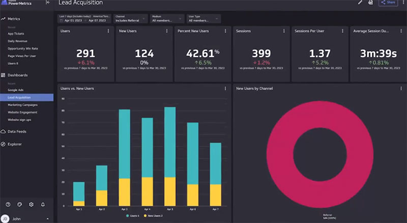
Power BI
Developed by Microsoft, Power BI integrates seamlessly with existing enterprise systems. It excels at real-time reporting, making it ideal for organizations that need fast, continuously updated insights.
Looker Studio
Formerly Google Data Studio, Looker Studio shines in collaborative storytelling. It enables teams to combine multiple data sources into a single narrative view, perfect for marketing, product, and performance reporting.
Qlik Sense
Qlik Sense focuses on associative analytics, allowing users to follow data relationships in any direction. This non-linear approach supports deeper storytelling by uncovering connections that traditional dashboards might miss.
Choosing the Right Tool for Your Data Story
The best visualization tool isn’t always the most popular—it’s the one that fits your specific context.
Consider these factors before choosing:
- Audience type (executives, analysts, customers)
- Data complexity and volume
- Integration needs with existing systems
- Level of interactivity required
- Learning curve and team skill level
A clear understanding of your narrative goal will guide the right choice.
Best Practices for Turning Metrics into Meaningful Stories
Even the most powerful tool needs thoughtful execution. Strong data stories follow proven principles:
- Start with a question, not a chart
- Use visuals that match the message (avoid unnecessary complexity)
- Limit color palettes to emphasize meaning
- Provide annotations and context where interpretation matters
- End with insight or action, not just information
When these practices are applied, data becomes memorable and persuasive.
The Future of Data Storytelling
As artificial intelligence and automation evolve, visualization tools are becoming smarter. Features like natural language queries, automated insights, and predictive visuals are shaping the next generation of data storytelling—where insights surface proactively, not reactively.
The result is a future where understanding data feels less like analysis and more like conversation.
Frequently Asked Questions
1. What is data storytelling in visualization?
Data storytelling combines visuals, narrative structure, and context to explain insights clearly and persuasively.
2. Are data visualization tools only for analysts?
No. Many tools are designed for non-technical users, enabling managers and teams to explore insights independently.
3. How do interactive dashboards improve understanding?
Interactivity allows users to drill down, filter, and explore data, making insights more personal and actionable.
4. Can data visualization reduce decision-making time?
Yes. Visual patterns are processed faster than raw numbers, leading to quicker and more confident decisions.
5. What industries benefit most from data storytelling?
Finance, healthcare, marketing, logistics, and technology all rely heavily on visualization to interpret complex metrics.
6. How important is design in data visualization?
Design is critical. Poor design can obscure insights, while good design amplifies clarity and impact.
7. What skills are needed to create effective data stories?
A mix of analytical thinking, visual design awareness, and domain knowledge produces the strongest results.